AI Infographic Maker
How Long Should an Infographic Be?
How long an infographic should be — the right dimensions and amount of content for social feeds, blog posts, and print, plus when to split into a series.
Published August 11, 2026
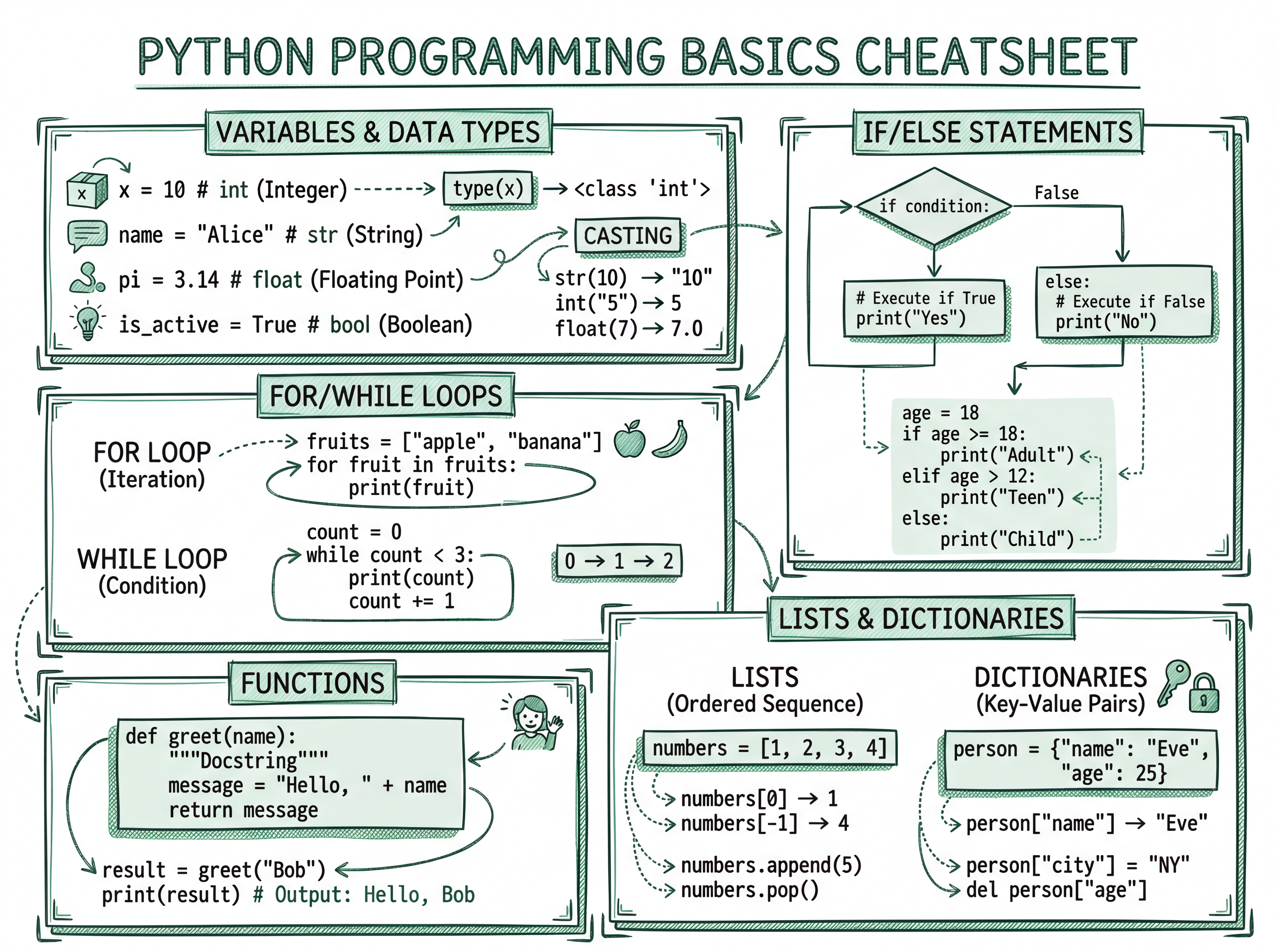
Short answer: as short as it can be while still making its point — usually one screen. The right length depends on where the infographic will live, but the failure mode is always the same: too much crammed in. Here's how to size it for each place it'll appear.
Match the length to the platform
| Where it lives | Recommended | Why |
|---|---|---|
| Social feed (Instagram, LinkedIn) | One screen — 4:5 or 1:1, one idea | Feeds reward single, skimmable images |
| Carousel post | Several 4:5 slides, one idea each | Higher saves than one crammed image |
| Blog post | Taller vertical infographic | Readers will scroll a dedicated page |
| Print / handout | A4/Letter, moderate density | Fixed size; keep it legible |
The real limit is attention, not pixels
Regardless of dimensions, the content rule holds: a headline, 4–8 short points, no paragraphs. If someone can't get the gist in about 15 seconds, it's too long. Length isn't measured in pixels — it's measured in how much a reader has to work.
When to split into a series
If you're tempted to make a very tall "mega infographic," that's usually a sign you have several ideas, not one. Split it:
- A listicle → a carousel, one item per slide.
- A long guide → a series of standalone graphics.
- A report → one stat card per finding.
The one-line rule
When in doubt, one idea, one image. If you have more to say, make more images — not a longer one.