AI Infographic Maker
How to Make an Infographic for a School Project
A clear, teacher-friendly way to turn class notes into an infographic for a school project — what to include, how to structure it, and a fast AI workflow.
Published August 11, 2026
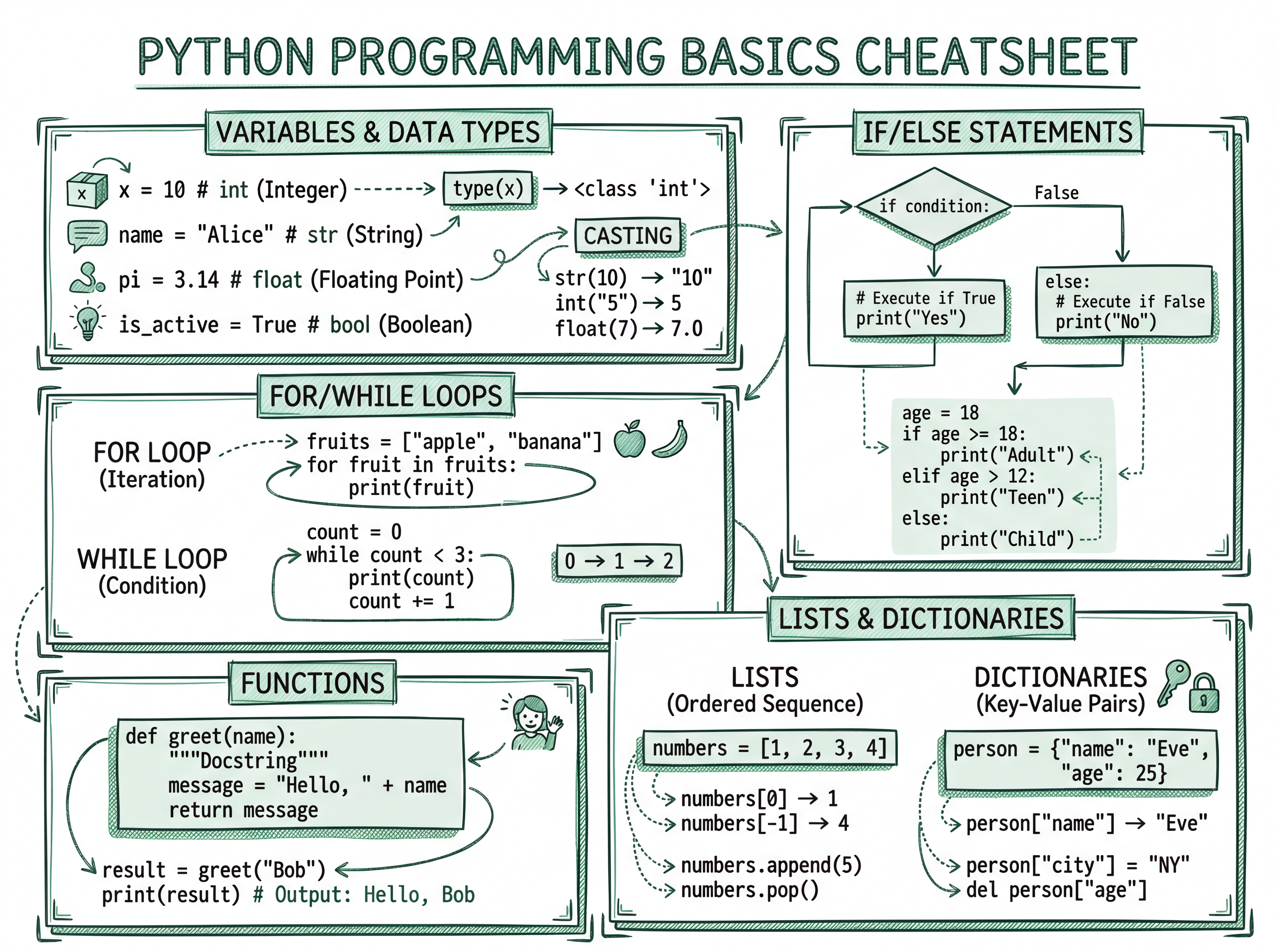
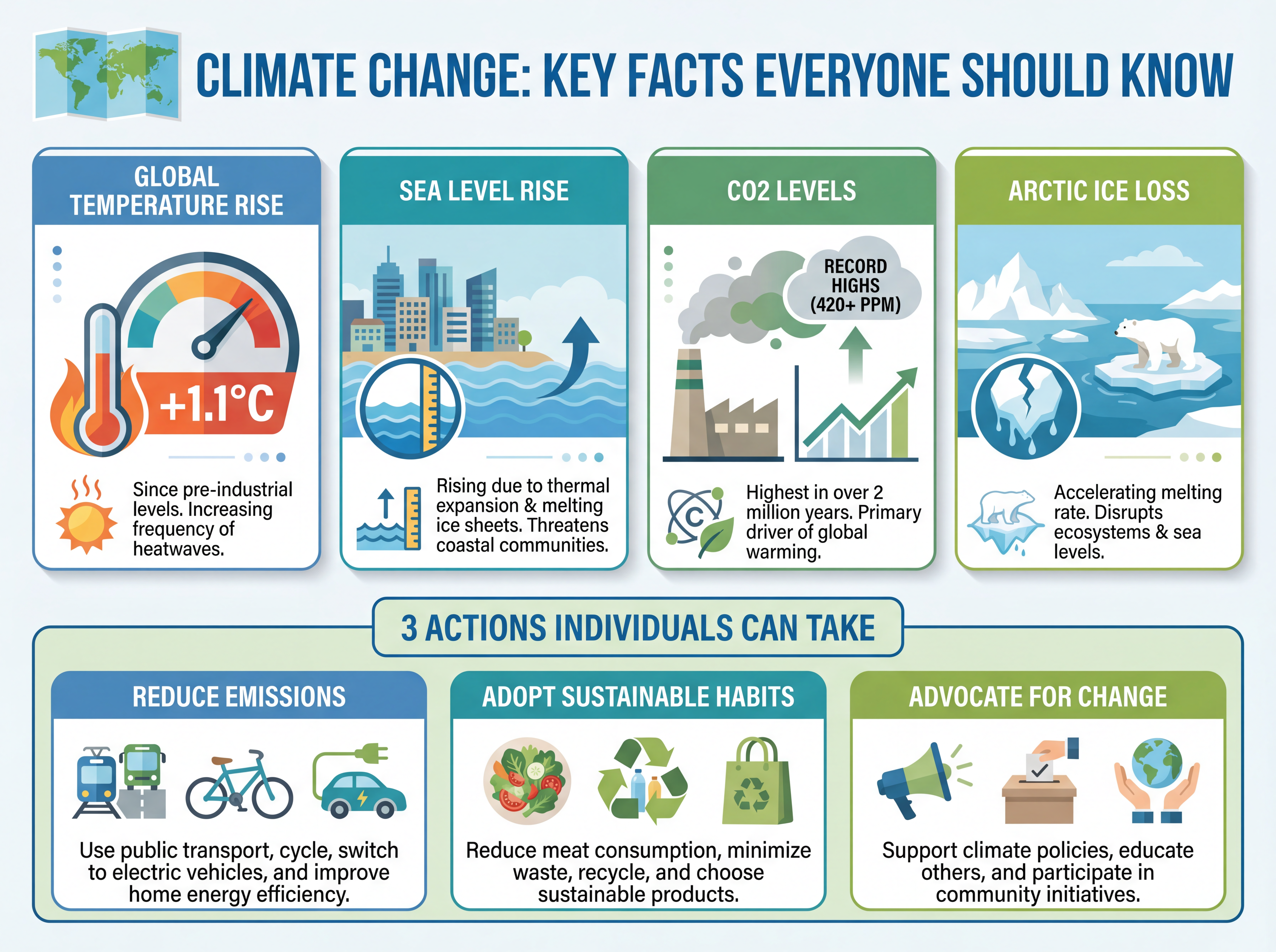
A great school-project infographic does one thing well: it makes a single topic instantly clear with a title, a handful of key facts, and simple visuals. The trick isn't design talent — it's choosing what to leave out. Here's how to build one that earns marks and reads at a glance.
What to include (and what to skip)
- Include: a clear title, one focused topic, 4–8 key facts or steps, simple icons or visuals, and a short sources line.
- Skip: long paragraphs, everything from your notes, and more than one main idea.
Your infographic is a summary, not the whole report. If a teacher can grasp the topic in ten seconds, it's working.
Choose a structure that fits your topic
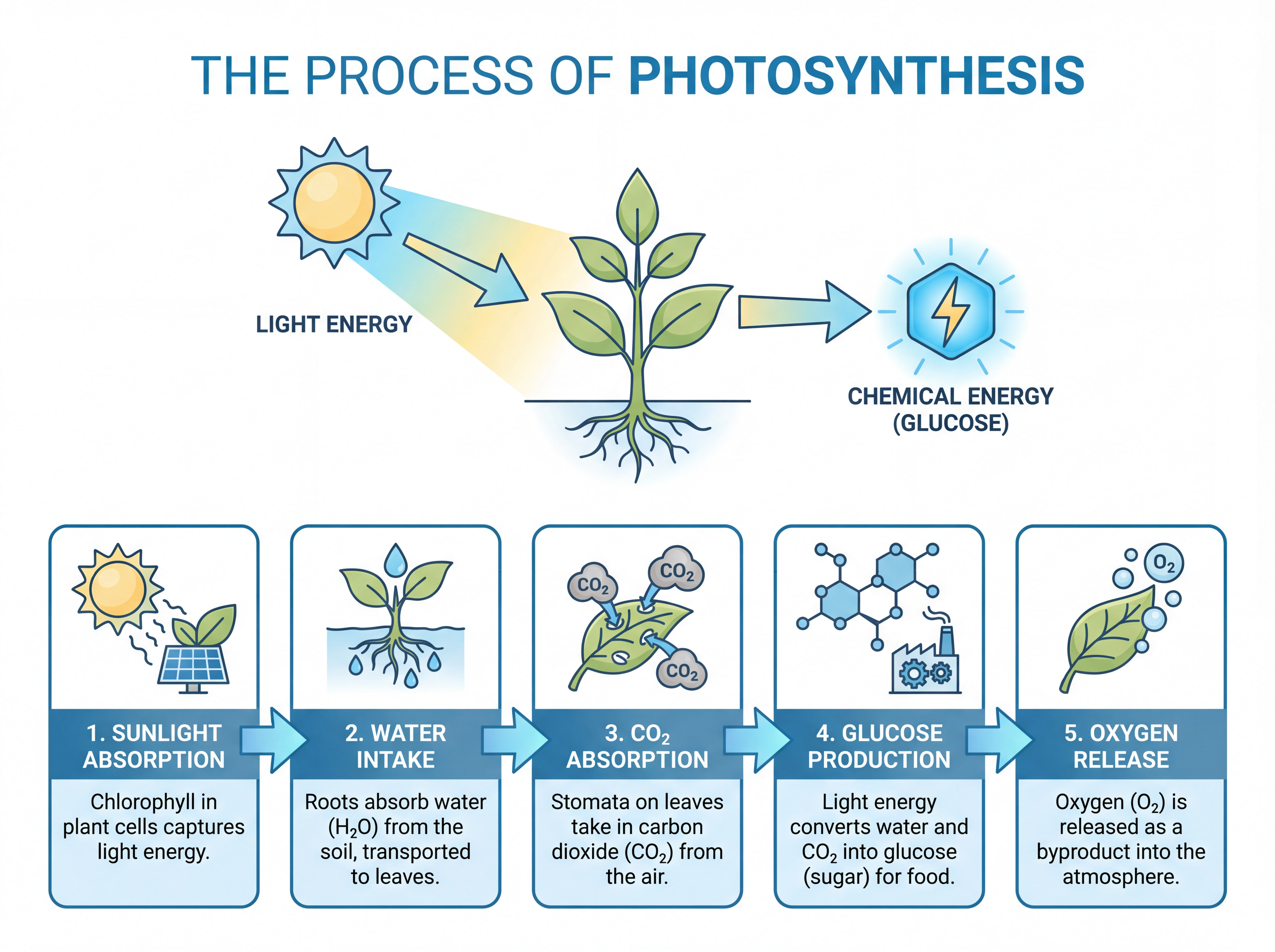
- Process (e.g. how photosynthesis works) → numbered steps.
- Timeline (e.g. events leading to a war) → dates in order.
- Comparison (e.g. two ecosystems) → side-by-side columns.
- Key facts (e.g. facts about a planet) → a grid of stats.
Pick the one that matches your project and the layout writes itself.
Step by step
- Narrow to one topic the infographic will answer.
- Pull 4–8 key facts from your notes or textbook.
- Pick a structure (process, timeline, comparison, or key facts).
- Generate the infographic from your text, then refine.
- Add a sources line to keep it academically honest.
A quick tip for better marks
Teachers reward clarity and accuracy over decoration. Keep your palette to two or three colors, make the title obvious, and double-check every fact. A clean, correct infographic beats a busy, flashy one every time.