AI Infographic Maker
How to Make an Infographic for Instagram (Without Design Skills)
A step-by-step guide to creating scroll-stopping Instagram infographics from plain text — the right sizes, layout rules, and a fast AI workflow.
Published August 11, 2026
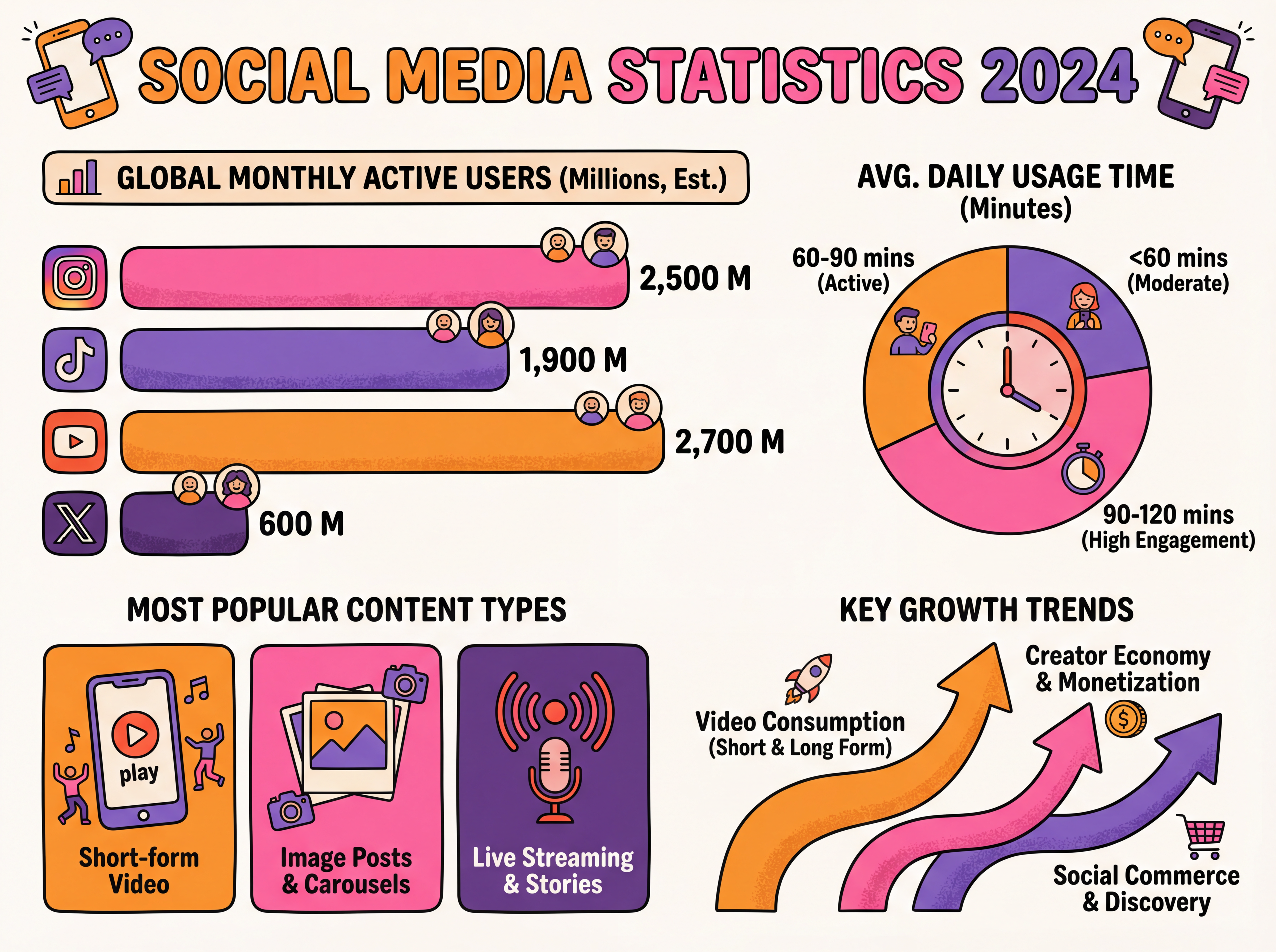
Instagram rewards infographics that are skimmable, vertical, and single-idea. The best-performing ones make one useful point instantly clear, use a 4:5 portrait canvas, and keep text to a headline plus a few short lines. This guide covers the sizing and layout rules that matter, then shows the fastest way to go from raw text to a finished post.
What size should an Instagram infographic be?
| Placement | Pixel size | Ratio |
|---|---|---|
| Feed post (recommended) | 1080 × 1350 | 4:5 |
| Square feed post | 1080 × 1080 | 1:1 |
| Story / Reel cover | 1080 × 1920 | 9:16 |
| Carousel slide | 1080 × 1350 | 4:5 |
The 4:5 portrait format takes up the most vertical space as people scroll, which is why it consistently outperforms square posts.
What makes an Instagram infographic actually stop the scroll
- One idea per graphic. If you have five tips, that's a five-slide carousel — not one cramped image.
- A headline that promises a payoff. "3 hooks that doubled my saves" beats "Social media tips."
- High contrast + big type. It has to be legible as a thumbnail.
- Consistent color and spacing. Pick 2–3 colors and stick to them across a carousel so the set looks intentional.
Step by step
- Write or paste your content. A short list, a caption draft, or the key points from an article.
- Choose a 4:5 portrait canvas so the post claims maximum feed space.
- Pick a clean, high-contrast style and a background that keeps the text readable.
- Cut to one idea per image. For a longer piece, split it into carousel slides.
- Export in HD and write a caption that repeats the core takeaway.
Common mistakes to avoid
- Cramming a whole blog post into one image (make a carousel instead).
- Tiny text that's unreadable at thumbnail size.
- Low contrast between text and background.
- Mixing five fonts and colors — pick a small palette and repeat it.
Get the size and the single-idea rule right, and the rest is just consistency. Start from your existing text and let the layout do the heavy lifting.